
plotlyで作るインタラクティブで高品質なグラフ|Pythonでデータを可視化する
Aru
Aru's テクログ(Aruaru0)

この記事では、Pythonのデータ可視化ライブラリ「Seaborn」の新しいオブジェクトインターフェース「Seaborn Objects」について、チートシート形式で詳しく解説します。Seaborn Objectsを利用することで、散布図、折れ線グラフ、棒グラフ、ヒストグラム、箱ひげ図など、Seabornの美しいグラフを直感的で使いやすいインターフェースで作成することが可能になりました。

Seabornは、Python用のデータ可視化ライブラリです。matplotlibと比べて、美しいグラフを作ることが可能なので、見栄えの良い綺麗なグラフを作りたい場合に利用している人は多いと思います。
私も、分析時の確認用のちょっとしたグラフはmatplotlib、プレゼン用の人に見せるグラフはseabornと使い分けています。あと、seabornしか無いグラフなどもありますので、そういった場合もseabornを利用しています。
今回、紹介するはseabornの「Objects」というインタフェースになります。Objectsでは、グラフオブジェクトにデータに対する処理を追加していくことで、グラフを定義していく形式になりました。R言語に慣れている方には、ggplotに似たインタフェースといえばわかると思います。
このインタフェースでは、これまで以上に直感的にグラフの操作ができるようになりました。こちらのインタフェースを使って損はないと感じます。
seabornのobjectsインタフェースに関する資料:
https://seaborn.pydata.org/tutorial/objects_interface.html
また、日本語を使いたい場合は以下の記事を参考にしてください

seaborn.objectsのインポートする場合、以下のようにします。
import seaborn.objects as soとりあえず、散布図を書いてみます。
import seaborn as sns
import numpy as np
import pandas as pd
import seaborn.objects as so
x = np.arange(0, 100)
x = np.concatenate([x,x])
y = np.random.randint(0, 100, 200)
z = ['A' for _ in range(100)] + ['B' for _ in range(100)]
df = pd.DataFrame({'x': x, 'y': y, 'z' : z})

so.Plot(df, x='x', y = 'y').add(so.Dot())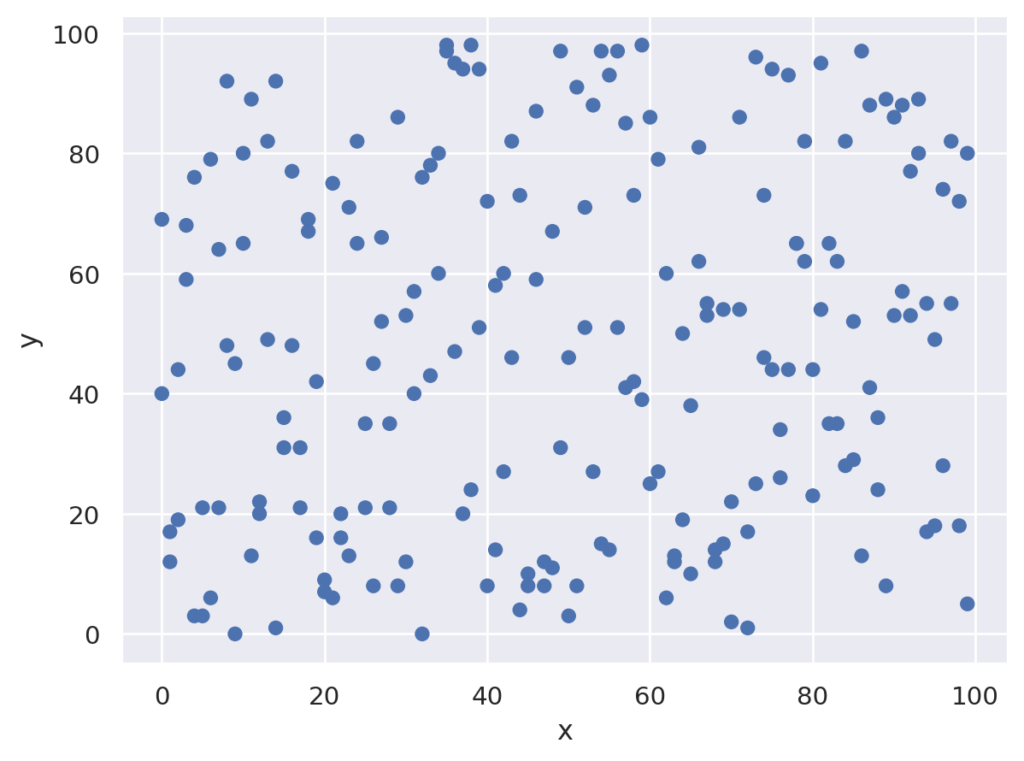

公式では、()で囲って、以下のように表記しています。このようにすると、.addの部分を改行して書くことができます。何行にもわたる場合は、公式の表記がよいと思いますが、ちょっと書くだけなら()で挟まなくてもよいと思います。
(
  so.Plot(df, x='x', y = 'y')
  .add(so.Dot())
)描画の指示は以下の部分です。objectsインターフェースでは、Plotにデータを指定してオブジェクトを作成し、.addインタフェースを呼び出すことで具体的な描画指示を行う形になります。
下の例を日本語で考えると「データフレームdfの列xをx軸に、yをy軸としたオブジェクトを生成して、それを点(Dot)で描画」という指示になります。オブジェクト思考的で分かりやすいと思いますが、どうでしょうか。
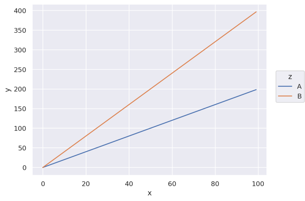
so.Plot(df, x='x', y = 'y').add(so.Dot())ここでデータフレームのz列で色を変えたい場合は、以下のようにPlotのパラメータを追加します。
so.Plot(df, x='x', y = 'y', color='z').add(so.Dot())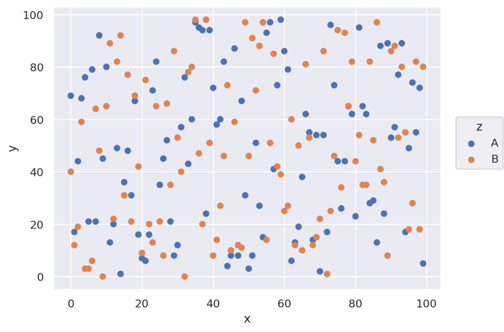
以下では、Plotオブジェクトの持つメソッドや、設定できるグラフなどをサンプルコードを使いながら説明したいと思います。
以下の各コードは、それぞれの項目では、基本的に単体で実行できるようにしています。それ以外は、文中にコメントを入れています。
Plotの定義は以下になります。パラメータがかなり多いです。以下、主要なパラメータについて説明します。
seaborn.objects.Plot(*args, data=None, x=None, y=None, color=None, alpha=None, fill=None, marker=None, pointsize=None, stroke=None, linewidth=None, linestyle=None, fillcolor=None, fillalpha=None, edgewidth=None, edgestyle=None, edgecolor=None, edgealpha=None, text=None, halign=None, valign=None, offset=None, fontsize=None, xmin=None, xmax=None, ymin=None, ymax=None, group=None)
データです。pandasのデータフレームまたは、辞書型で指定できます
x, yにデータのキーを指定します(pandasの場合は列名)
データをグループ分け(色分け)する場合の、グループに該当するキー(列)を指定します。
基本的には、data, x, yまたはdata, x, y, colorを指定します。
残りのパラメータは主にグラフの描画・装飾に関するパラメータになります。上記以外のパラメータについては、公式サイトがかなりみやすくまとめられているのでそちらを参照してください。
Plot等の関数の引数(プロパティ)に関するリンクは以下になります。
この記事では、基本的な使い方をコードと実行した時のグラフ付きで解説しています。Objectsには多数のオプションがありますので、より細かな使い方、オプションにつては公式のAPIリファレンスを参考にしてください。
addメソッドは、可視化の方法をしているためのものです。指定した、グラフ種類等がグラフに追加されます。グラフ描画の指定は、このaddで行います。
import seaborn.objects as so

data = {
    'x' : [i for i in range(100)],
    'y' : [i*i for i in range(-50, 50)]
}

(
so.Plot(data, x='x', y = 'y')
.add(so.Line())
)
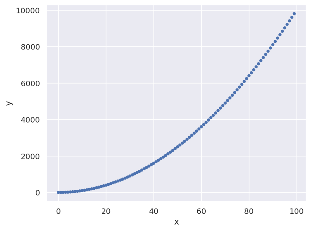
x, y,color,pointsizeなどの様々なキーワード対応した表示プロマティを変更できます。
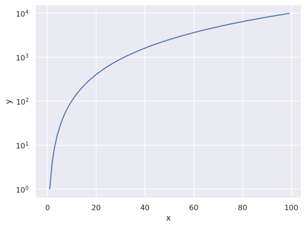
例えば、以下の指定でy軸をlogスケールに変更できます。
import seaborn.objects as so

data = {
    'x' : [i for i in range(100)],
    'y' : [i*i for i in range(100)]
}

(
so.Plot(data, x='x', y = 'y')
.add(so.Line())
.scale(y="log")
)
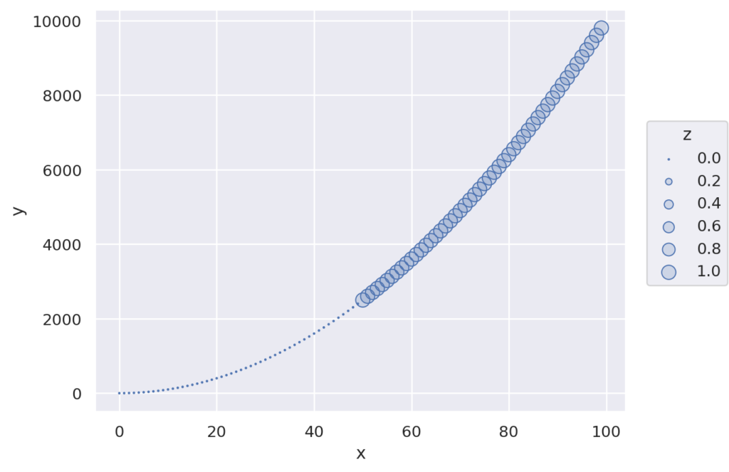
以下のように指定すると、点の大きさを変更できます。
import seaborn.objects as so

data = {
    'x' : [i for i in range(100)],
    'y' : [i*i for i in range(100)],
    'z' : [0 for _ in range(50)] + [1 for _ in range(50)]
}

(
so.Plot(data, x='x', y = 'y', pointsize='z')
.add(so.Dots())
.scale(pointsize=(1,10))
)
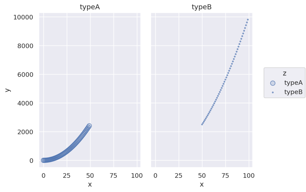
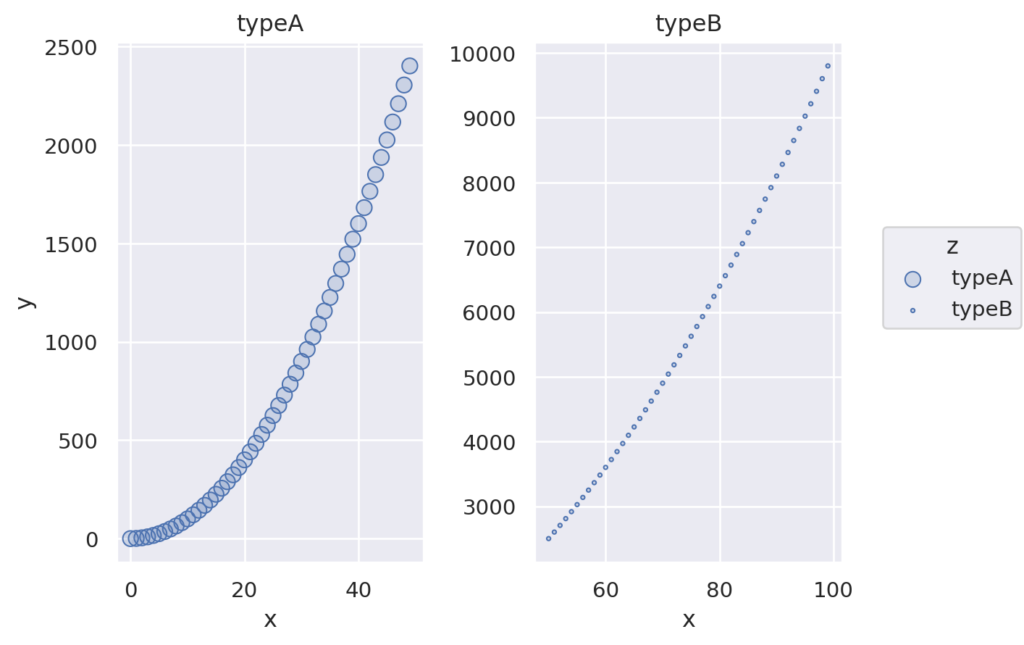
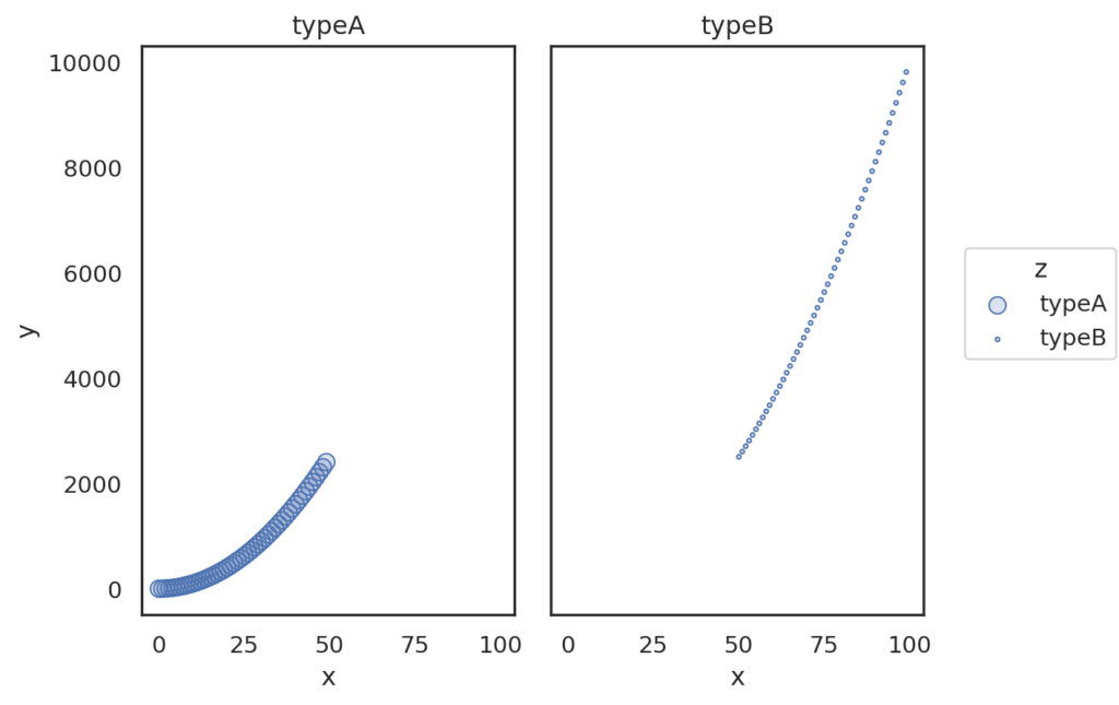
サブプロットを作成できます。なお、複数のキーを指定すると2次元のグリッドでサブプロットが作成できます。orderオプションなどで指定すれば、さらに細かな設定も可能です。
import seaborn.objects as so

data = {
    'x' : [i for i in range(100)],
    'y' : [i*i for i in range(100)],
    'z' : ['typeA' for _ in range(50)] + ['typeB' for _ in range(50)]
}

(
so.Plot(data, x='x', y = 'y', pointsize='z')
.add(so.Dots())
.facet('z')
)
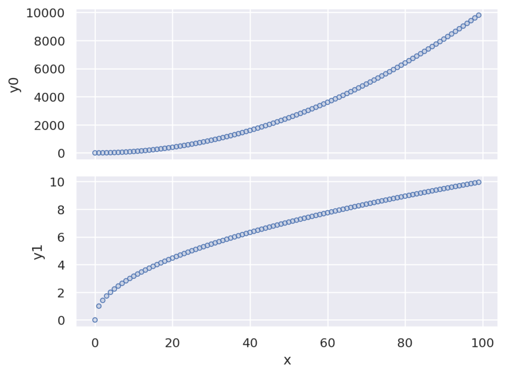
Plotで指定されたxまたはyと、複数のyまたはxと組み合わせてサブプロットを行います。説明ではわかりにくいですが、サンプルを見ればわかると思います。サンプルでは、1つのxに対して、y0, y1の2つのyに対してプロットが行われています。
import seaborn.objects as so

data = {
    'x' : [i for i in range(100)],
    'y0' : [i*i for i in range(100)],
    'y1' : [i**0.5 for i in range(100)],
}

(
so.Plot(data, x='x')
.pair(y = ['y0', 'y1'])
.add(so.Dots())
)
画像サイズを設定します。facetでサブプロットする場合も、指定したサイズになります
※将来的に変更される可能性があります
import seaborn.objects as so

data = {
    'x' : [i for i in range(100)],
    'y' : [i*i for i in range(100)]
}

(
so.Plot(data, x='x', y = 'y')
.add(so.Line())
.layout(size=(4,6))
)
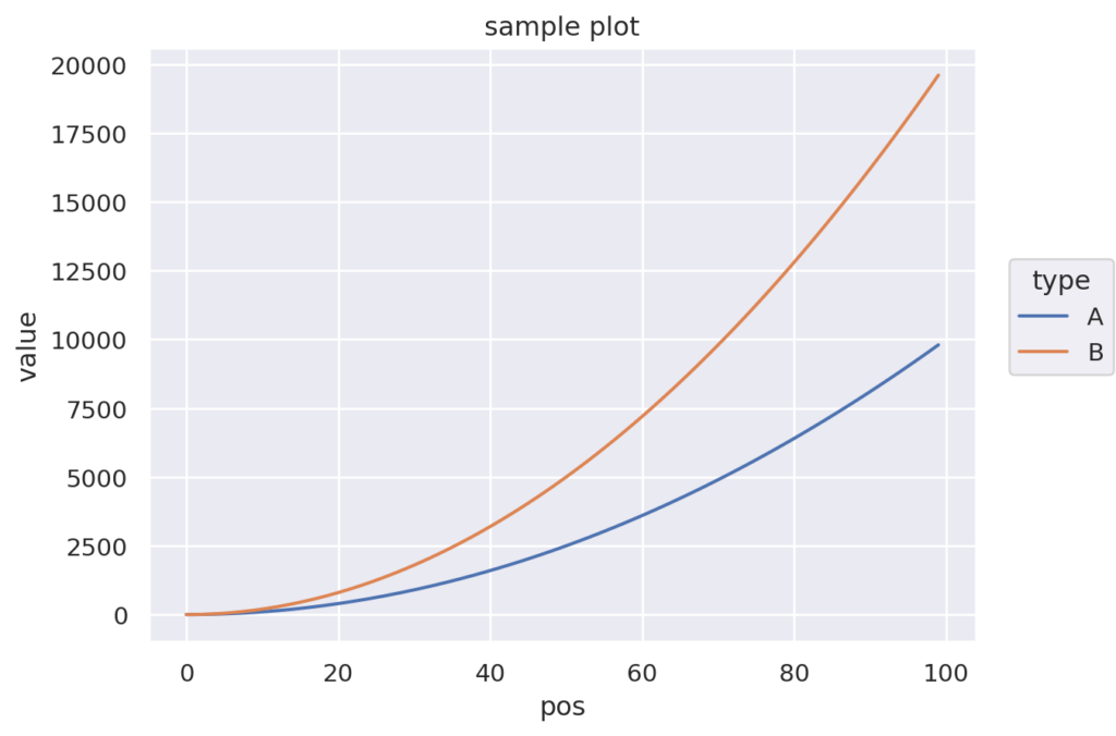
軸(x, y)、凡例(color)、タイトル(title)を指定します。
import seaborn.objects as so

data = {
    'x' : [i for i in range(100)] + [i for i in range(100)] ,
    'y' : [i*i for i in range(100)] + [i*i*2 for i in range(100)],
    'z' : ['A' for _ in range(100)] + ['B' for _ in range(100)]
}

(
so.Plot(data, x='x', y = 'y', color='z')
.add(so.Line())
.label(x="pos", y="value", title="sample plot", color="type")
)
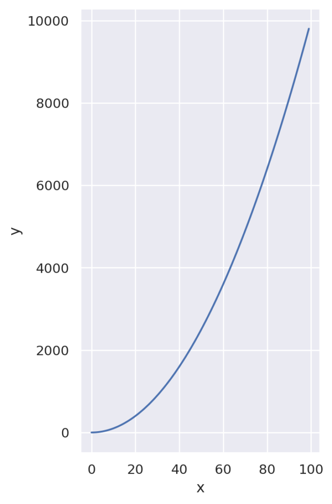
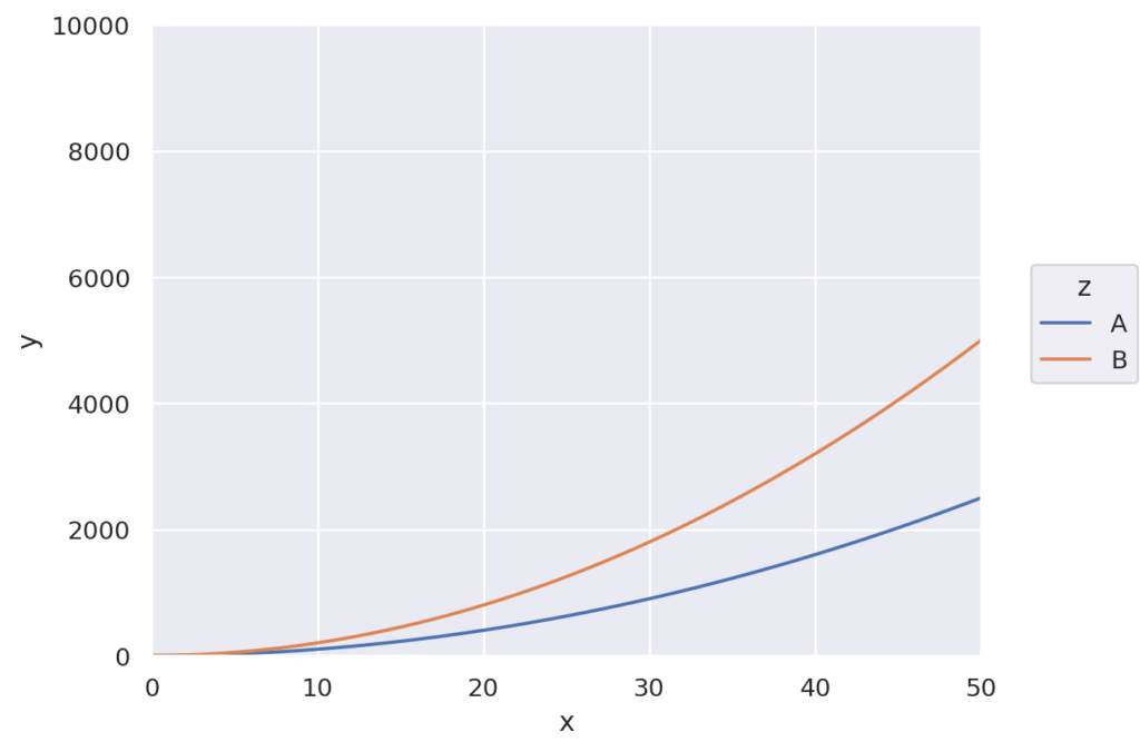
データの範囲を指定します。x, y それぞれに対して、(min, max)の形式で指定できます。
import seaborn.objects as so

data = {
    'x' : [i for i in range(100)] + [i for i in range(100)] ,
    'y' : [i*i for i in range(100)] + [i*i*2 for i in range(100)],
    'z' : ['A' for _ in range(100)] + ['B' for _ in range(100)]
}

(
so.Plot(data, x='x', y = 'y', color='z')
.add(so.Line())
.limit(x=(0, 50), y =(0, 10000))
)
サブプロットの軸のメモリを制御します。FalseまたはTrueを設定し、Trueの場合はメモリが共通に、Falseの場合はメモリがグラフ毎に調整されます。以下のコードはfacetのコードでshareを変更したものです。それぞれのグラフの範囲が独立に設定されていることがわかると思います。
import seaborn.objects as so

data = {
    'x' : [i for i in range(100)],
    'y' : [i*i for i in range(100)],
    'z' : ['typeA' for _ in range(50)] + ['typeB' for _ in range(50)]
}

(
so.Plot(data, x='x', y = 'y', pointsize='z')
.add(so.Dots())
.facet('z')
.share(x = False, y = False)
)
プロットの外観(テーマ)を制御します。詳しくはこちらを見てください。
サンプルで指定している、axis_styleは、darkgrid, whitegrid, dark, white, ticksなどが設定できます。
import seaborn.objects as so
from seaborn import axes_style


data = {
    'x' : [i for i in range(100)],
    'y' : [i*i for i in range(100)],
    'z' : ['typeA' for _ in range(50)] + ['typeB' for _ in range(50)]
}

(
so.Plot(data, x='x', y = 'y', pointsize='z')
.add(so.Dots())
.facet('z')
.theme(axes_style("white"))
)
matplotlibを利用して後処理を行う場合などに利用します。詳しくはAPIマニュアルを参照してください
プロット結果を、ファイルやバッファに書き込みます。詳しくはAPIマニュアルを参照してください
matplotlibと連携させる場合に利用します。詳しくはAPIマニュアルを参照してください
関数のプロパティについては、プロパティに関するリンクを参照してください。
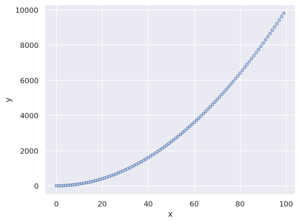
点を描画します。関数の宣言は以下の通りです。
seaborn.objects.Dot(artist_kws=<factory>, marker=<‘o’>, pointsize=<6>, stroke=<0.75>, color=<‘C0’>, alpha=<1>, fill=<True>, edgecolor=<depend:color>, edgealpha=<depend:alpha>, edgewidth=<0.5>, edgestyle=<‘-‘>)
import seaborn.objects as so

data = { 'x' : [i for i in range(100)], 'y' : [i*i for i in range(100)],}

(
so.Plot(data, x='x', y = 'y')
.add(so.Dot(pointsize=4))
)
点を描画するメソッドです。Dotと引数が少し異なります。見た感じでは、点がたくさんになるとこちらの方が見易いみたいです。
seaborn.objects.Dots(artist_kws=<factory>, marker=<rc:scatter.marker>, pointsize=<4>, stroke=<0.75>, color=<‘C0’>, alpha=<1>, fill=<True>, fillcolor=<depend:color>, fillalpha=<0.2>)
import seaborn.objects as so


data = { 'x' : [i for i in range(100)], 'y' : [i*i for i in range(100)],}

(
so.Plot(data, x='x', y = 'y')
.add(so.Dots())
)
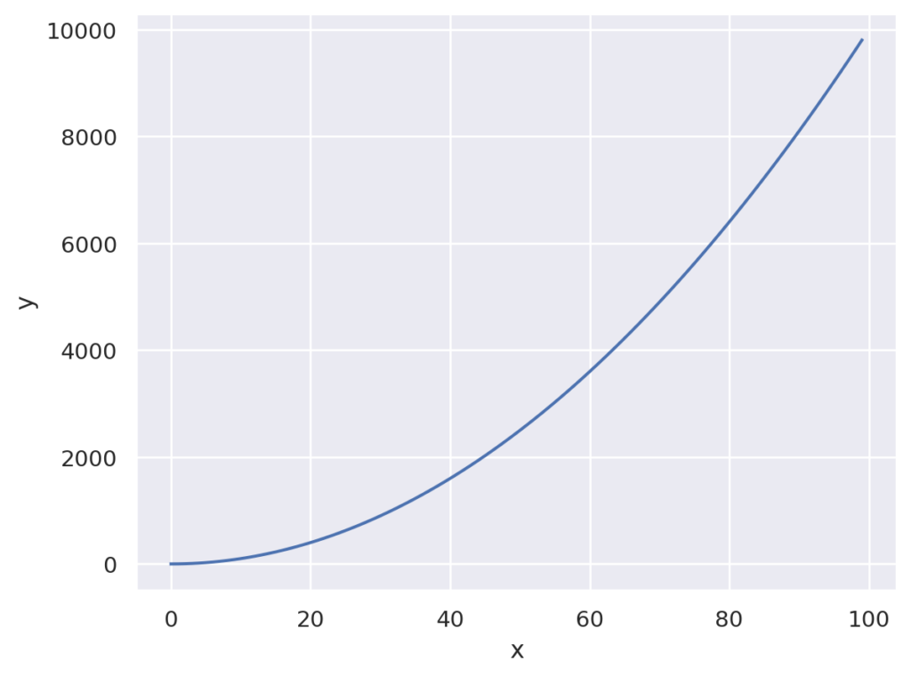
折れ線グラフを描画します
seaborn.objects.Line(artist_kws=<factory>, color=<‘C0’>, alpha=<1>, linewidth=<rc:lines.linewidth>, linestyle=<rc:lines.linestyle>, marker=<rc:lines.marker>, pointsize=<rc:lines.markersize>, fillcolor=<depend:color>, edgecolor=<depend:color>, edgewidth=<rc:lines.markeredgewidth>)
import seaborn.objects as so

data = { 'x' : [i for i in range(100)], 'y' : [i*i for i in range(100)],}

(
so.Plot(data, x='x', y = 'y')
.add(so.Line())
)
折れ線グラフを描画します。パラメータは少なめです。標準だとLineと似たグラフになります。高速だそうです。
seaborn.objects.Lines(artist_kws=<factory>, color=<‘C0’>, alpha=<1>, linewidth=<rc:lines.linewidth>, linestyle=<rc:lines.linestyle>)
import seaborn.objects as so

data = { 'x' : [i for i in range(100)], 'y' : [i*i for i in range(100)],}

(
so.Plot(data, x='x', y = 'y')
.add(so.Lines())
)
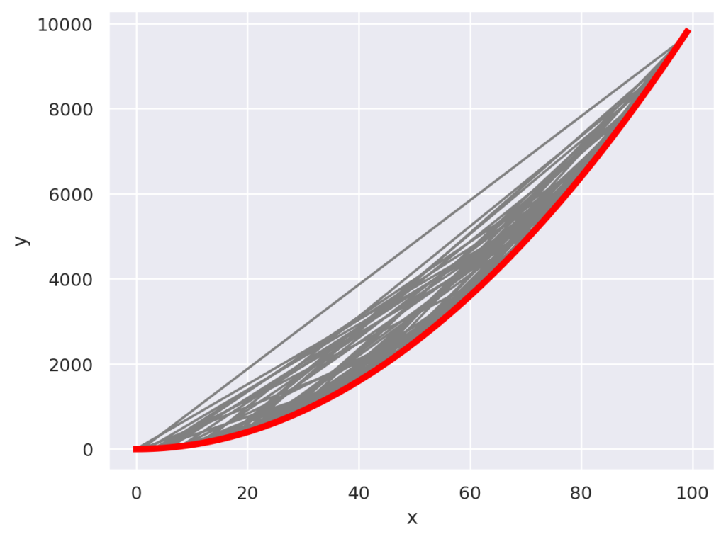
Lineと似ていますが、データの並べ替えを行いません。
seaborn.objects。パス( artist_kws=<factory>、 color=<‘C0’>、 alpha=<1>、 linewidth=<rc:lines.linewidth>、 linestyle=<rc:lines.linestyle>、 marker=<rc:lines.marker >、 pointsize=<rc:lines.markersize>、 fillcolor=<depend:color>、 edgecolor=<depend:color>、 edgewidth=<rc:lines.markeredgewidth> )
赤い線がLinesでの描画です。灰色の線はPathでの描画です。xをシャッフルしていますので、Pathではグラフが壊れています。一方、Linesはソートを行うので、y = x**2のグラフとなっています。
import seaborn.objects as so
import random

x = [i for i in range(100)]
random.shuffle(x)
y = [x[i]*x[i] for i in range(100)]

data = { 'x' : x, 'y' : y}

(
so.Plot(data, x='x', y = 'y')
.add(so.Path(color="gray"))
.add(so.Lines(linewidth=4, color="red"))
)
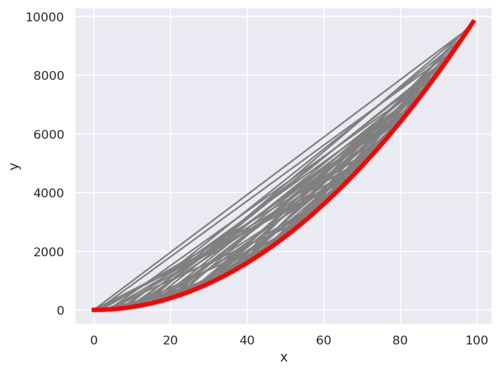
Pathと同じですが、パラメータは少なめです。
seaborn.objects.Paths(artist_kws=<factory>, color=<‘C0’>, alpha=<1>, linewidth=<rc:lines.linewidth>, linestyle=<rc:lines.linestyle>)
import seaborn.objects as so
import random

x = [i for i in range(100)]
random.shuffle(x)
y = [x[i]*x[i] for i in range(100)]

data = { 'x' : x, 'y' : y}

(
so.Plot(data, x='x', y = 'y')
.add(so.Paths(color="gray"))
.add(so.Lines(linewidth=4, color="red"))
)
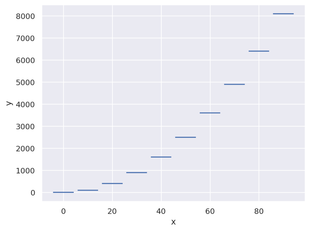
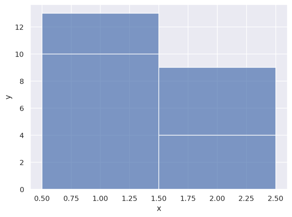
よくわからないです。つぎのような横線で表示されます。公式の説明は以下になります「A line segment is drawn for each datapoint, centered on the value along the orientation axis:」
seaborn.objects.Dash(artist_kws=<factory>, color=<‘C0’>, alpha=<1>, linewidth=<rc:lines.linewidth>, linestyle=<rc:lines.linestyle>, width=<0.8>)
import seaborn.objects as so

data = { 'x' : [i for i in range(0,100,10)], 'y' : [i*i for i in range(0,100,10)],}

(
so.Plot(data, x='x', y = 'y')
.add(so.Dash())
)
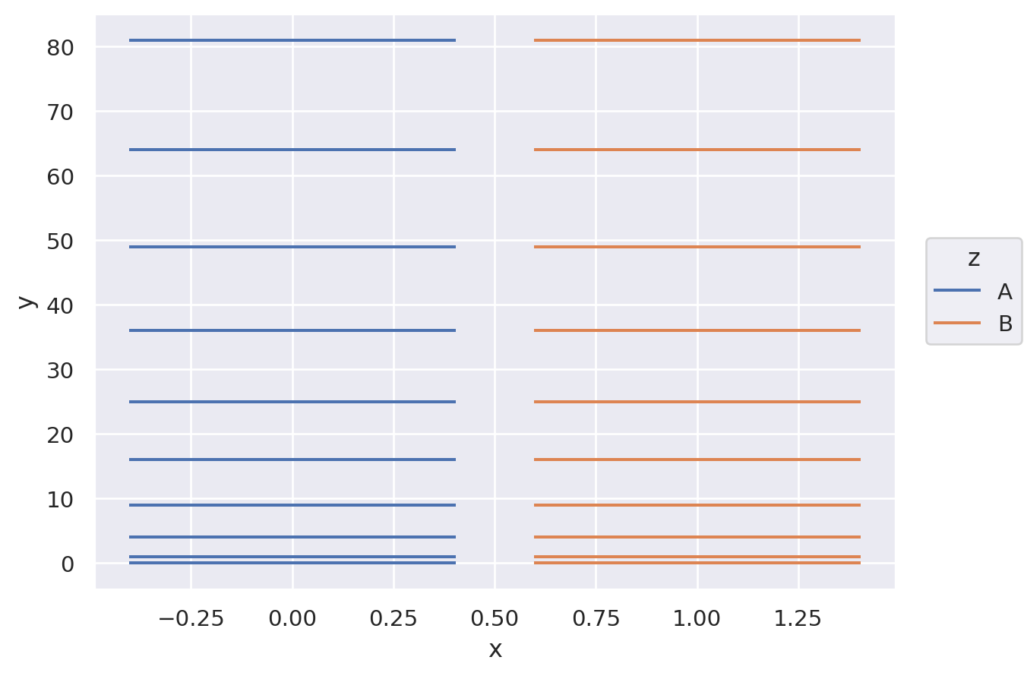
また、次のようなグラフも作れます
import seaborn.objects as so

x = [0 for i in range(10)] + [1 for _ in range(10)]
y = [i*i for i in range(10)]
y = y + y
z = ['A' for _ in range(10)] + ['B' for _ in range(10)]
data = { 'x' : x, 'y': y, 'z':z}

(
so.Plot(data, x='x', y = 'y', color='z')
.add(so.Dash())
)
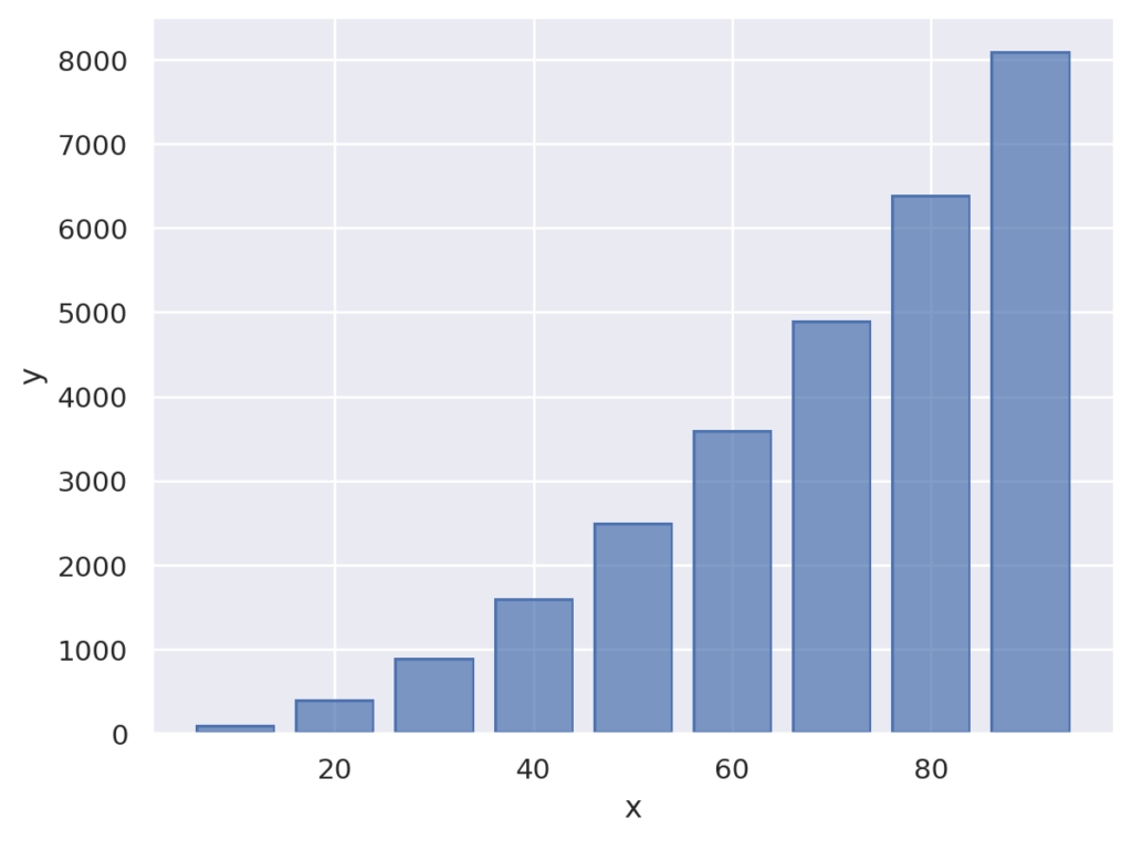
棒グラフを描画します。グラフが縦・横の棒グラフのどちらになるかは、x, yに指定したデータのタイプより決定されます。
seaborn.objects.Bar(artist_kws=<factory>, color=<‘C0’>, alpha=<0.7>, fill=<True>, edgecolor=<depend:color>, edgealpha=<1>, edgewidth=<rc:patch.linewidth>, edgestyle=<‘-‘>, width=<0.8>, baseline=<0>)
import seaborn.objects as so

data = { 'x' : [i for i in range(0,100,10)], 'y' : [i*i for i in range(0,100,10)],}

(
so.Plot(data, x='x', y = 'y')
.add(so.Bar())
)
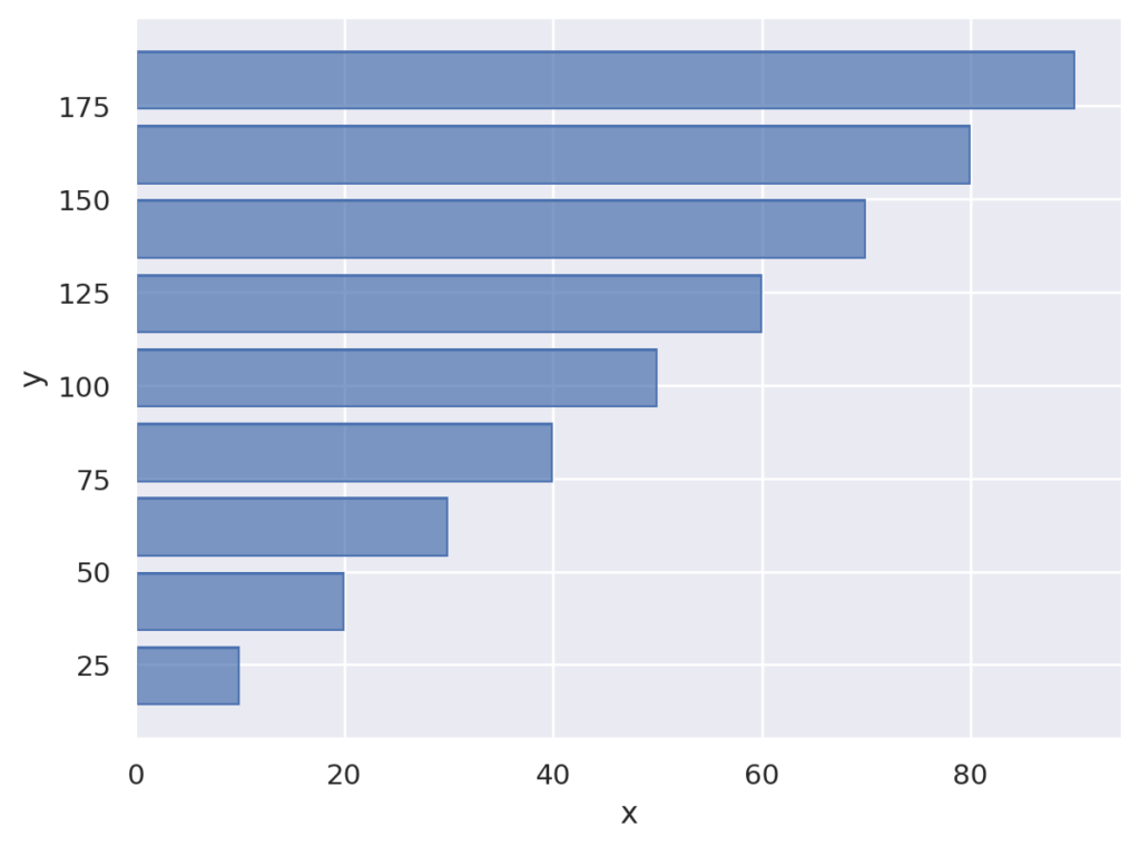
両方数値の場合は、orientを利用して明示的に指定します。
import seaborn.objects as so

data = { 'x' : [i for i in range(0,100,10)], 'y' : [i*2+2 for i in range(0,100,10)],}

(
so.Plot(data, x='x', y = 'y')
.add(so.Bar(),  orient="y")
)
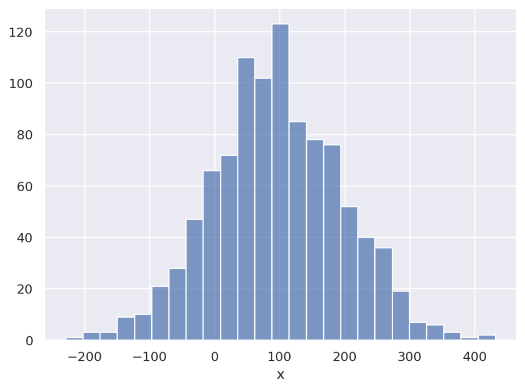
棒グラフを描画します。ヒストグラムに向くように設計されています。
seaborn.objects.Bars(artist_kws=<factory>, color=<‘C0’>, alpha=<0.7>, fill=<True>, edgecolor=<rc:patch.edgecolor>, edgealpha=<1>, edgewidth=<auto>, edgestyle=<‘-‘>, width=<1>, baseline=<0>)
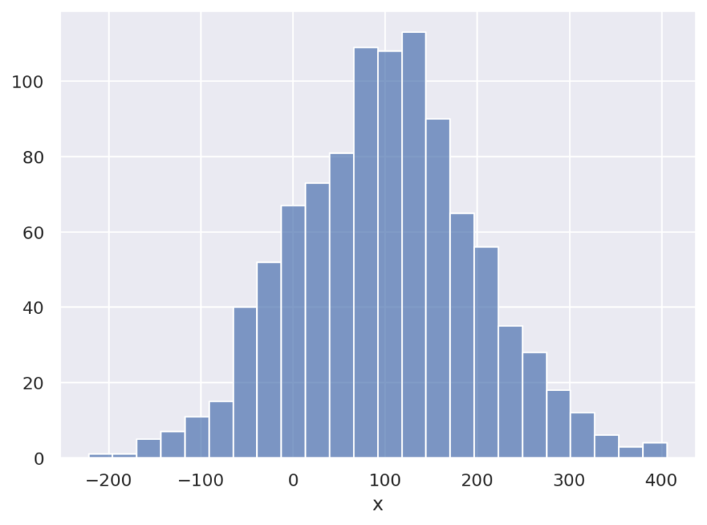
以下の例では、平均100、標準偏差100の正規分布の乱数を作成し、ヒストグラムを生成、プロットしています。
import seaborn.objects as so
import random

data = { 'x' : [random.normalvariate(100,100) for i in range(0,1000)],}

(
so.Plot(data, x='x')
.add(so.Bars(), so.Hist())
)
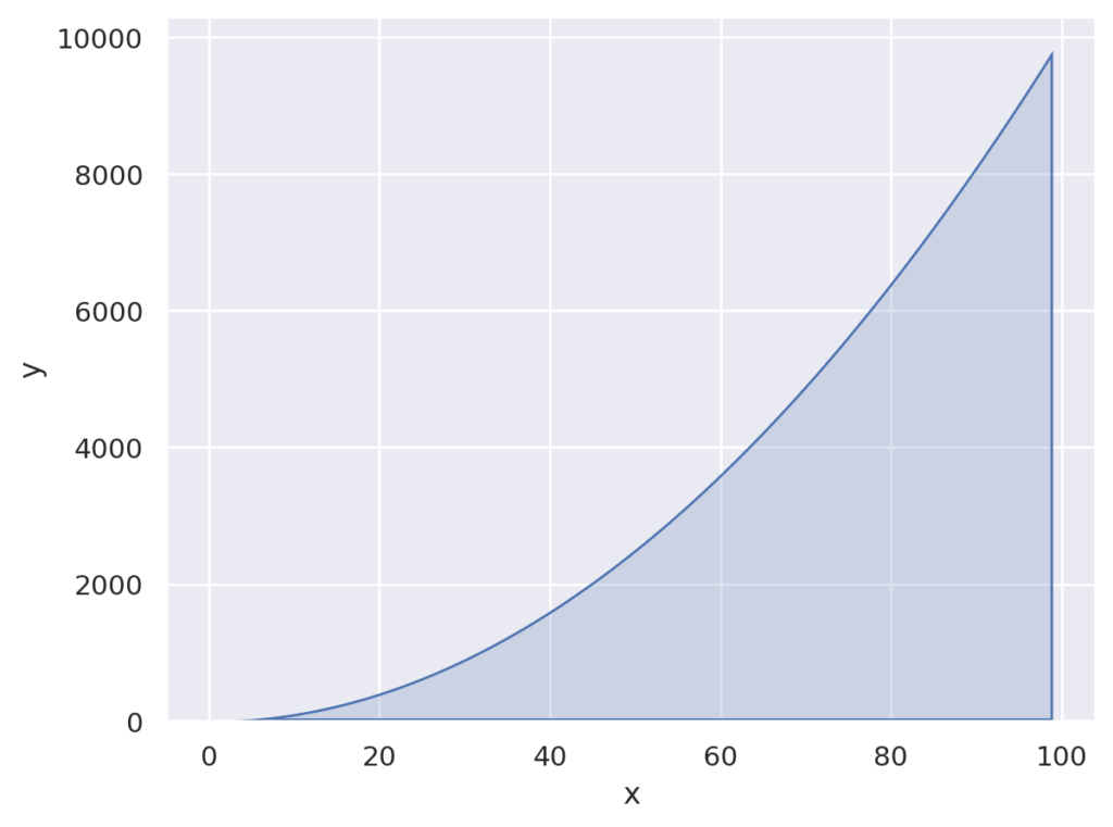
塗りつぶしのついたラインを描画します。 説明より、グラフを見た方が分かりやすいです。
seaborn.objects.Area(artist_kws=<factory>, color=<‘C0’>, alpha=<0.2>, fill=<True>, edgecolor=<depend:color>, edgealpha=<1>, edgewidth=<rc:patch.linewidth>, edgestyle=<‘-‘>, baseline=<0>)
import seaborn.objects as so

data = { 'x' : [i for i in range(100)], 'y' : [i*i for i in range(100)],}

(
so.Plot(data, x='x', y = 'y')
.add(so.Area())
)
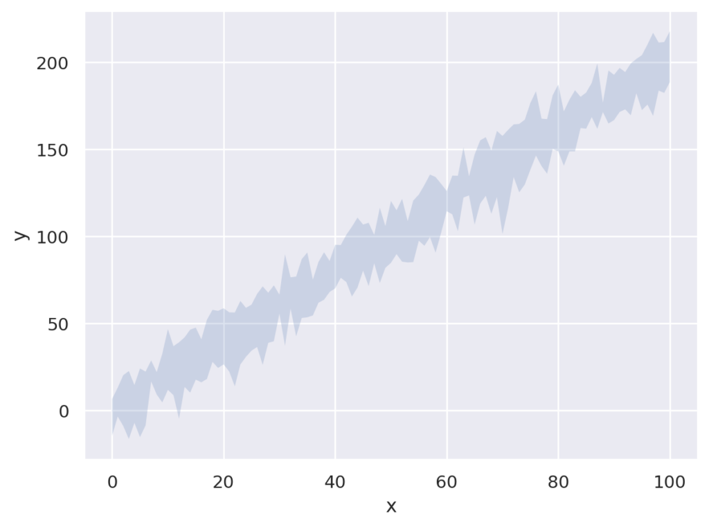
値の幅を塗りつぶしたグラフを描画します。
seaborn.objects.Band(artist_kws=<factory>, color=<‘C0’>, alpha=<0.2>, fill=<True>, edgecolor=<depend:color>, edgealpha=<1>, edgewidth=<0>, edgestyle=<‘-‘>)
例では、0から100の範囲をランダムに1000個生成してxとし、$2x + noise$をyとしたデータを作成しています。0から100の範囲の値を1000個なので、同値がいくつか生成されるので、1つのxに対して複数のyが生成されます。それが幅として描画されます。
import seaborn.objects as so
import random

x = [random.randint(0,100) for _ in range(1000)]
y = [2*i+random.normalvariate(0,10) for i in x]

data = { 'x' : x, 'y': y }

(
so.Plot(data, x='x', y = 'y')
.add(so.Band())
)
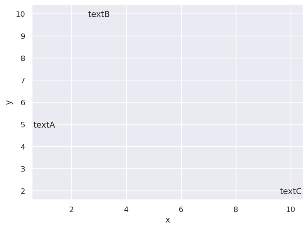
グラフにテキストを描画します。
seaborn.objects.Text(artist_kws=<factory>, text=<”>, color=<‘k’>, alpha=<1>, fontsize=<rc:font.size>, halign=<‘center’>, valign=<‘center_baseline’>, offset=<4>)
import seaborn.objects as so
import random


data = { 'x' : [1,3,10], 'y': [5,10,2], 'z': ['textA', 'textB', 'textC'] }

(
so.Plot(data, x='x', y = 'y', text='z')
.add(so.Text())
)
統計関連のAPIです。Dots, Lineなどの描画と組み合わせて利用します。
データ集計関数です。デフォルトはmeanで、median, max, minなどが利用できます。
seaborn.objects.Agg(func=’mean’)
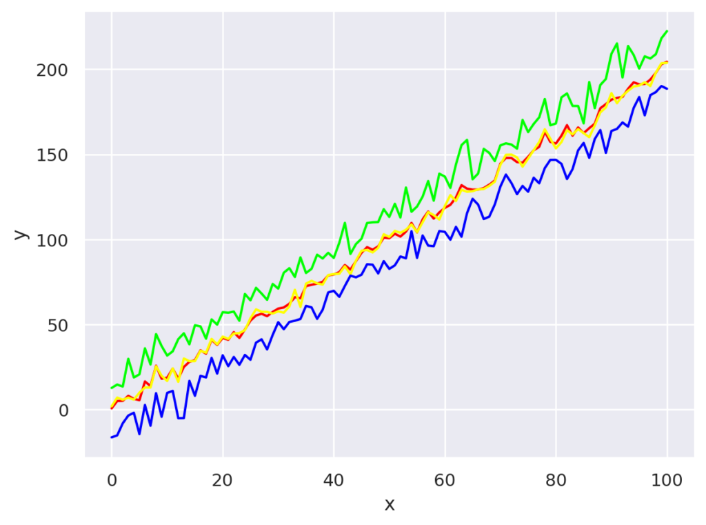
平均、中央値、最小値、最大値を描画します。
import seaborn.objects as so
import random

x = [random.randint(0,100) for _ in range(1000)]
y = [2*i+random.normalvariate(0,10) for i in x]

data = { 'x' : x, 'y': y }

(
so.Plot(data, x='x', y = 'y')
.add(so.Line(color=(1,0,0)), so.Agg())
.add(so.Line(color=(1,1,0)), so.Agg('median'))
.add(so.Line(color=(0,1,0)), so.Agg('max'))
.add(so.Line(color=(0,0,1)), so.Agg('min'))
)
ヒストグラムを計算します
seaborn.objects.Hist(stat=’count’, bins=’auto’, binwidth=None, binrange=None, common_norm=True, common_bins=True, cumulative=False, discrete=False)
import seaborn.objects as so
import random


data = {
    'x' : [random.normalvariate(100,100) for i in range(0,1000)],
}

(
so.Plot(data, x='x')
.add(so.Bars(), so.Hist())
)
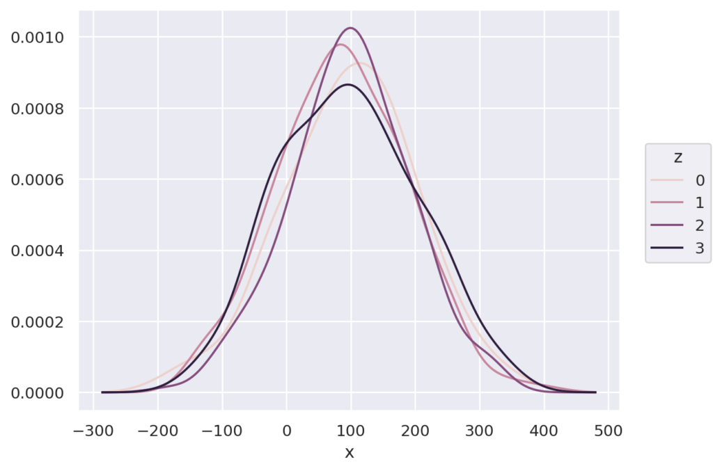
カーネル密度推定を計算します。
seaborn.objects.KDE(bw_adjust=1, bw_method=’scott’, common_norm=True, common_grid=True, gridsize=200, cut=3, cumulative=False)
import seaborn.objects as so
import random


data = {
    'x' : [random.normalvariate(100,100) for i in range(0,1000)],
    'z' : [random.randint(0, 3) for _ in range (1000)]}

(
so.Plot(data, x='x', color='z')
.add(so.Lines(), so.KDE())
)
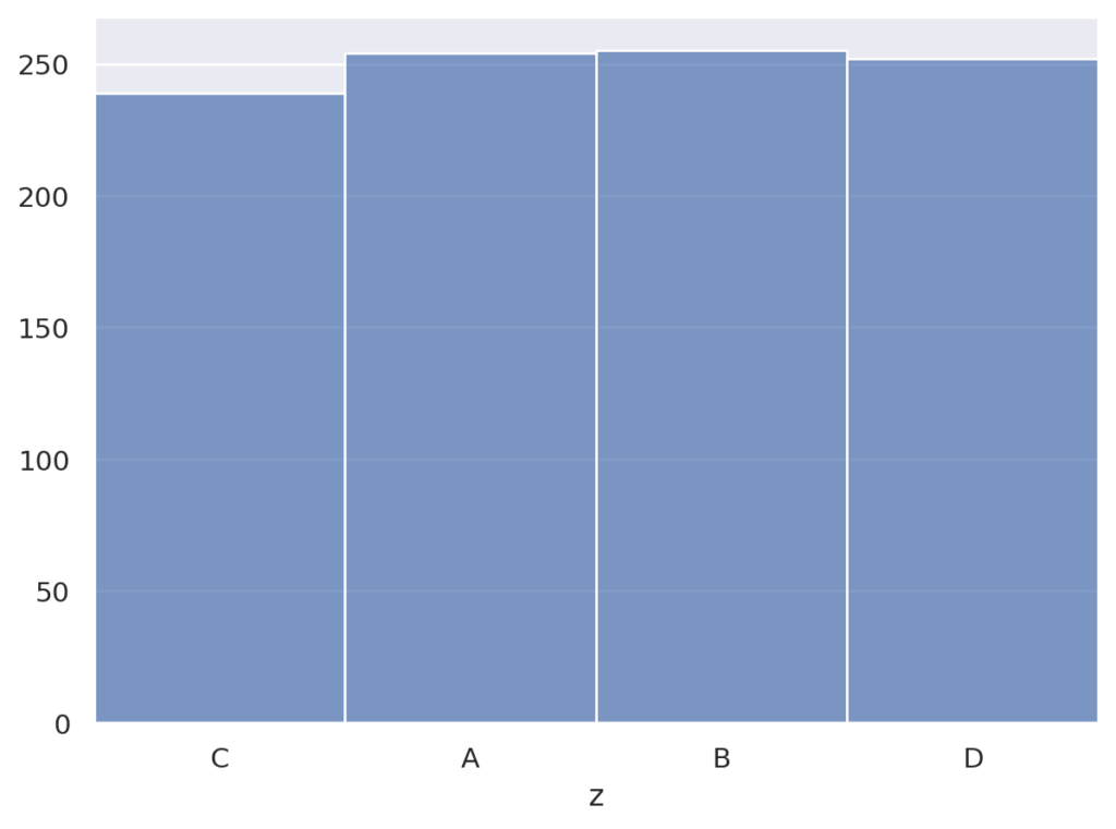
出現数をカウントします
seaborn.objects.Count
import seaborn.objects as so
import random


val = ['A', 'B', 'C', 'D']
data = {
    'z' : [val[random.randint(0, 3)] for _ in range (1000)]}

(
so.Plot(data, x='z')
.add(so.Bars(), so.Count())
)
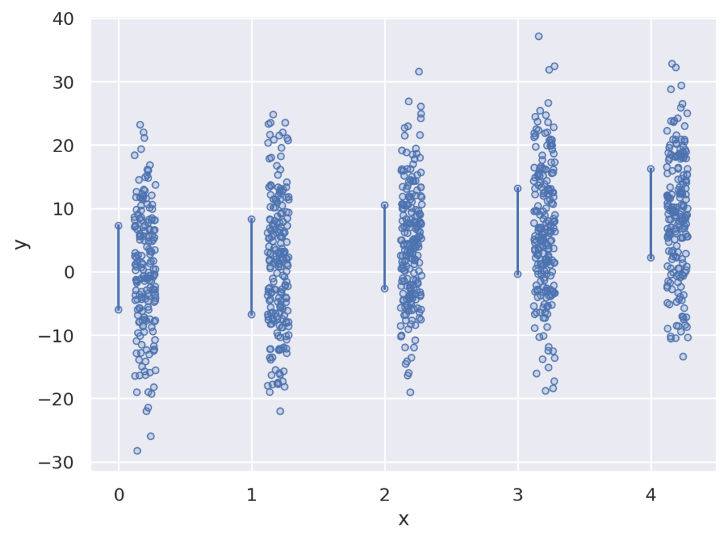
値をパーセンタイルを計算します
seaborn.objects.Perc(k=5, method=’linear’)
それぞれのxについて、10%, 25%, 50%, 75%, 90%を計算し、点で描画
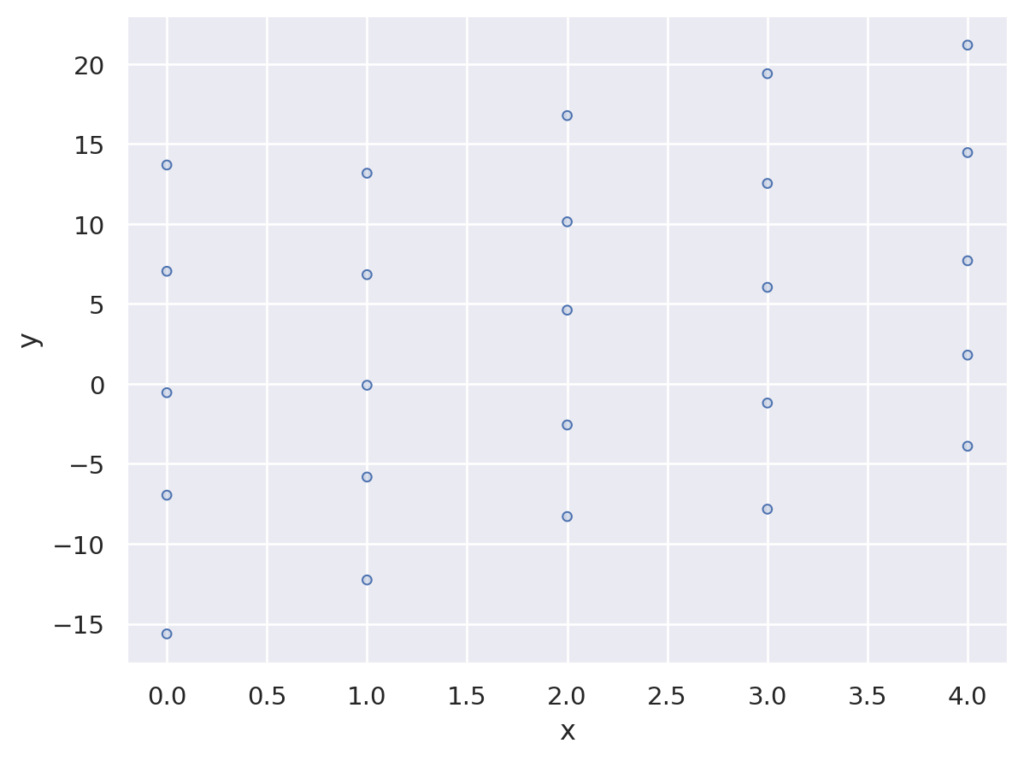
import seaborn.objects as so
import random

x = [random.randint(0,4) for _ in range(1000)]
y = [2*i+random.normalvariate(0,10) for i in x]

data = { 'x' : x, 'y': y }

(
so.Plot(data, x='x', y='y')
.add(so.Dots(), so.Perc([10, 25, 50, 75, 90]))
)
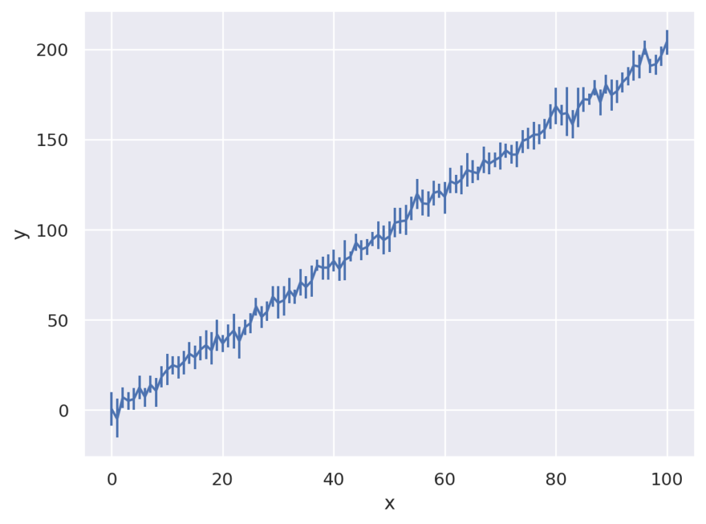
点推定値と、誤差範囲を計算します
seaborn.objects。Est ( func = ‘mean’、 errorbar = (‘ci’, 95)、 n_boot = 1000、 seed = None )
import seaborn.objects as so
import random

x = [random.randint(0,100) for _ in range(1000)]
y = [2*i+random.normalvariate(0,10) for i in x]

data = { 'x' : x, 'y': y }

(
so.Plot(data, x='x', y = 'y')
.add(so.Range(), so.Est())
)
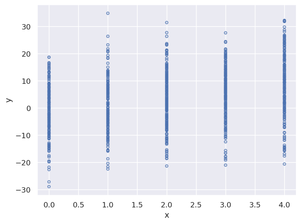
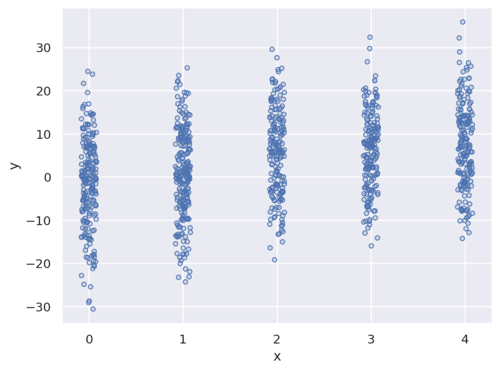
プロットをみやすくするために、少し揺らして描画します。
seaborn.objects.Jitter(width=<default>, x=0, y=0, seed=None)
重なりが減ってみやすくなります。
import seaborn.objects as so
import random

x = [random.randint(0,4) for _ in range(1000)]
y = [2*i+random.normalvariate(0,10) for i in x]

data = { 'x' : x, 'y': y }

(
so.Plot(data, x='x', y='y')
.add(so.Dots(), so.Jitter())
)
上に重ねて描画されます。
seaborn.objects.Stack
棒グラフを重ねて描画した場合
import seaborn.objects as so
import random


data = { 'x' : [1,1,2,2], 'y': [10,3,4,5] }

(
so.Plot(data, x='x', y = 'y')
.add(so.Bars(), so.Stack())
)
線グラフを重ねて描画
import seaborn.objects as so
import random

x = [i for i in range(100)]
x = x+x
y = [2*i for i in x]
z = ['A' for _ in range(100)] + ['B' for _ in range(100)]

data = {'x' : x , 'y' : y, 'z' : z}

(
so.Plot(data, x='x', y = 'y', color='z')
.add(so.Lines(), so.Stack())
)
設定値だけ、ずらして描画します
seaborn.objects.Shift(x=0, y=0)
パーセンタイルに対して、点を少しだけずらして描画
import seaborn.objects as so
import random

x = [random.randint(0,4) for _ in range(1000)]
y = [2*i+random.normalvariate(0,10) for i in x]

data = { 'x' : x, 'y': y }

(
so.Plot(data, x='x', y='y')
.add(so.Range(), so.Perc([25, 75]))
.add(so.Dots(), so.Perc([25, 75]))
.add(so.Dots(), so.Jitter(), so.Shift(x=0.2))
)
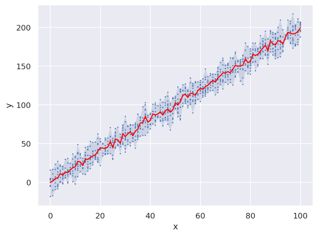
それぞれの描画は.で繋いで描画できます。以下は、バンドと、点と、平均値を描画した例です。
import seaborn.objects as so
import random

x = [random.randint(0,100) for _ in range(1000)]
y = [2*i+random.normalvariate(0,10) for i in x]

data = { 'x' : x, 'y': y }

(
so.Plot(data, x='x', y = 'y')
.add(so.Band())
.add(so.Dots(pointsize=1))
.add(so.Lines(color="red"), so.Agg())
)
seaborn objectsについて説明しました。ggplotに似たインタフェースなので、Rで使い慣れていた人には使いやすいかと思います。
データ分析などにも重宝するかと思います。