Go言語:数値→文字列、文字列→数値変換
Aru
Aru's テクログ(Aruaru0)

Pythonでのデータ可視化にはmatpltlibがよく使われますが、Seabornを使うことで、より見栄えの良いグラフを簡単に作成できます。本記事では、Seabornの使い方をサンプルコードを提供したグラフ別の早引き表形式で紹介し、目次から目的のグラフを検索できるようにしました。
Seabornは、Python用のデータ可視化ライブラリです。matplotlibと比べて、美しいグラフを作ることが可能です。Rを使い慣れている方は、ggplotと似た見栄えのグラフが作成できるツールといえばわかりやすいかもしれません。私自身、ggplotっぽい綺麗なグラフをpythonで作りたくて探していたところ、Seabornにいきあたりました。
seabornのドキュメント:https://seaborn.pydata.org/index.html
pipでインストール可能です。
pip install seabornAnacondaを利用している場合は、以下のコマンドでインストールします。
conda install seaborn
Google Colabでは、標準でインストールされていました。
公式にあるように、Pythonで以下のコードを実行します。
import seaborn as sns
df = sns.load_dataset("penguins")
sns.pairplot(df, hue="species")
実行すると以下のようなグラフが表示されます。このように、なにも指定しなくても綺麗がグラフが作れるのがSeabornのメリットです。

もし、グラフが表示されない場合は、明示的に表示させる必要があります(matplotlibが必要です)
import matplotlib.pyplot as plt
plt.show()Seabornでは、pandas, numpy, list, dictなどのほとんどのデータ形式を入力とすることができます。ただ、pandasのdataframe, seriesなどで入力するのが最も使いやすい印象です。
pythonの組み込み型のlistで入力する場合の例です。
import seaborn as sns
import random

n = 100
x = [i for i in range(n)]
y = [random.randint(0,100) for _ in range(n)]
sns.scatterplot(x = x, y = y)numpyで入力する場合の例です。
import seaborn as sns
import random
import numpy as np

x = np.arange(0, 100)
y = np.random.randint(0, 100, 100)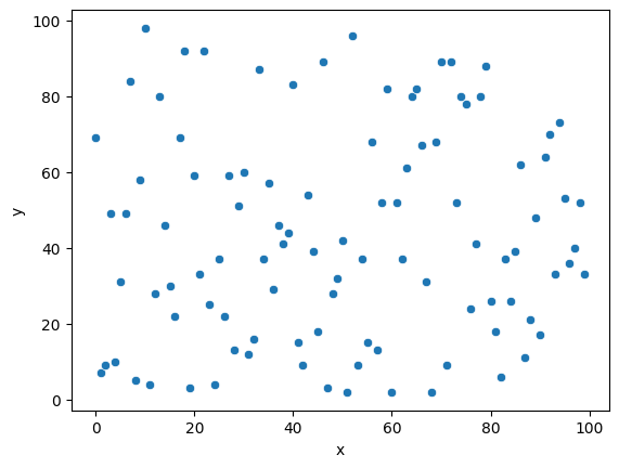
sns.scatterplot(x=x, y=y)pandasで入力する場合の例です。x,yを生成するのに、numpyを使っています。
import seaborn as sns
import random
import numpy as np
import pandas as pd

x = np.arange(0, 100)
y = np.random.randint(0, 100, 100)
df = pd.DataFrame({'x': x, 'y': y})
sns.scatterplot(x='x', y='y', data=df)
なお、pandasを入力とした場合は、x軸、y軸にラベルがつきます。
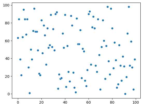
scatterplot)散布図は、scatterplot関数で描画します。
sizeオプションで点の大きさを指定できます。import seaborn as sns
import pandas as pd
import numpy as np
import matplotlib.pyplot as plt
x = np.arange(0, 100)
y = np.random.randint(0, 100, 100)
df = pd.DataFrame({'x': x, 'y': y})
sns.scatterplot(x='x', y='y', data=df)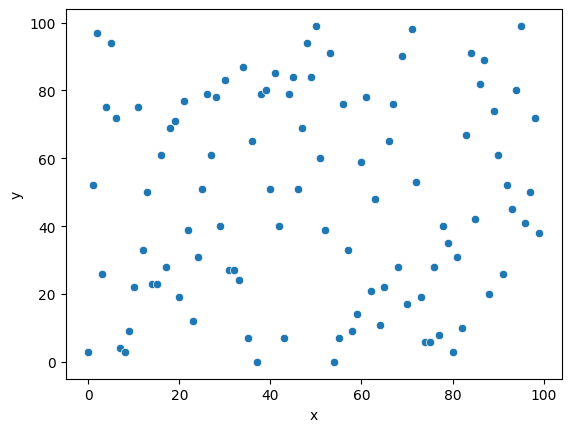
lineplot)折れ線はlineplot関数で描画します。
linewidthで線の太さを指定できますimport seaborn as sns
import pandas as pd
import numpy as np
import matplotlib.pyplot as plt
x = np.arange(0, 100)
y = np.random.randint(0, 100, 100)
df = pd.DataFrame({'x': x, 'y': y})
sns.lineplot(x='x', y='y', data=df)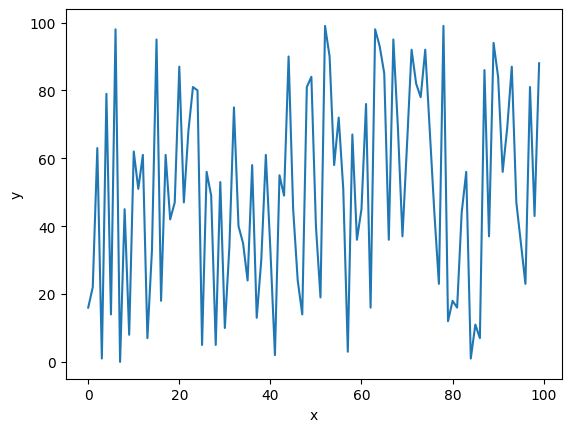
lineplot関数で、1つのx値に対して複数のy値がある場合、エラーバンドを含んだプロットになります。
err_style="bars"を設定すると誤差範囲がバーで表示されますimport seaborn as sns
import pandas as pd
import numpy as np
import matplotlib.pyplot as plt
x = np.random.randint(0, 100, 300)
y = x + np.random.normal(0, 10, 300)
df = pd.DataFrame({'x': x, 'y': y})
sns.lineplot(x='x', y='y', data=df)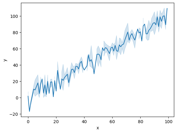
入力がデータフレームの場合は、それぞれの折れ線のラベル列をhueに設定します(本来、hueは色相の意味で、ここでは色分けを意味します)。
import seaborn as sns
import pandas as pd
import numpy as np
import matplotlib.pyplot as plt

x = np.arange(0, 100)
x = np.concatenate([x,x])
y = np.random.randint(0, 100, 200)
z = ['A' for _ in range(100)] + ['B' for _ in range(100)]
df = pd.DataFrame({'x': x, 'y': y, 'z' : z})
sns.lineplot(data=df, x='x', y='y', hue='z')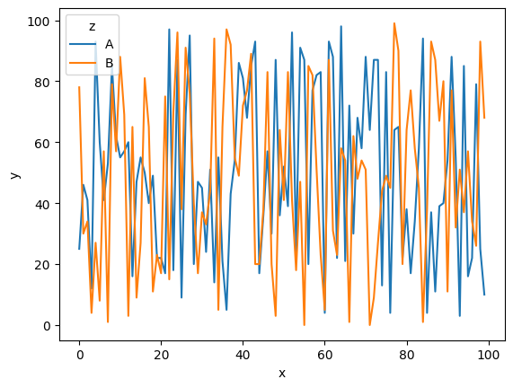
boxplot)箱ひげ図はboxplot関数です
import seaborn as sns

tips = sns.load_dataset("tips")

sns.boxplot(x="day", y="total_bill",
            hue="smoker", palette=["m", "g"],
            data=tips)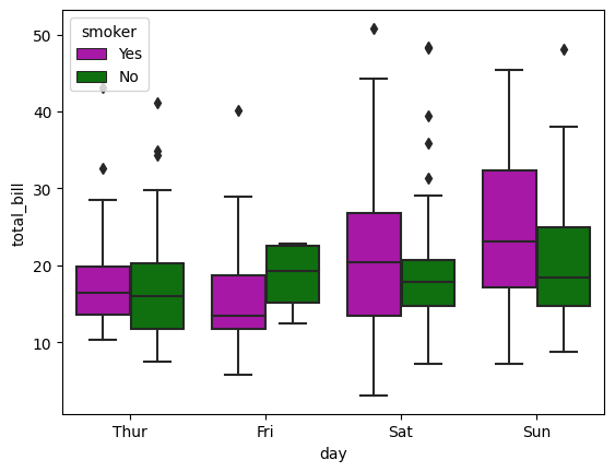
displot)棒グラフはdisplot関数です。
binsパラメータで、ビンの数を設定できますimport seaborn as sns
df = sns.load_dataset("penguins")
sns.displot(data = df, x="flipper_length_mm")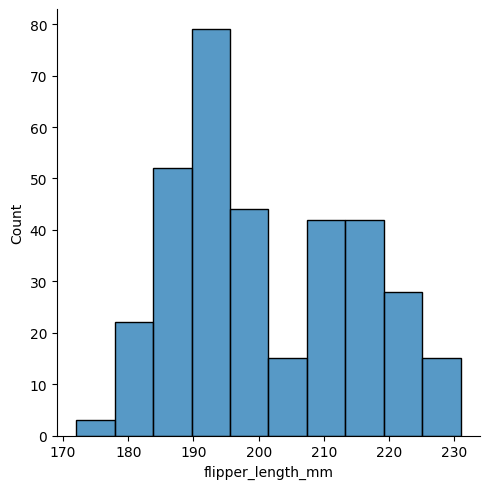
histplot)ヒストグラムはhistplotです。
import seaborn as sns

penguins = sns.load_dataset("penguins")
sns.histplot(data=penguins, x="flipper_length_mm")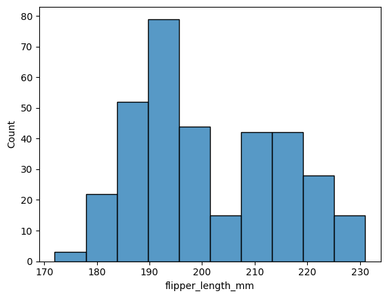
カーネル密度推定グラフを追加する場合は、kde=Trueを設定します。
import seaborn as sns

penguins = sns.load_dataset("penguins")

sns.histplot(data=penguins, x="flipper_length_mm", kde=True)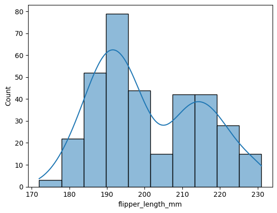
kdeplot)カーネル密度推定グラフだけを描画する場合は、kdeplot関数を使います。
import seaborn as sns

penguins = sns.load_dataset("penguins")
sns.kdeplot(data=penguins, x="flipper_length_mm")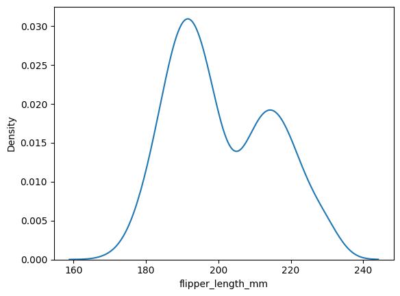
pairplot)seabornのグラフといえば、このイメージがあります。ペアプロット図です。pairplot関数で作成します。
散布図行列は、複数のデータがある場合に2変数同士の組み合わせで散布図を作成し、行列にまとめたグラフです。データ分析に用いられるグラフで、データ間の関係が視覚的に確認しやすい点がポイントです。
import seaborn as sns

penguins = sns.load_dataset("penguins")
sns.pairplot(penguins, hue="species")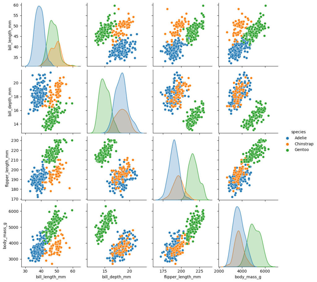
hue)hueオプションを利用します。
import seaborn as sns
penguins = sns.load_dataset("penguins")
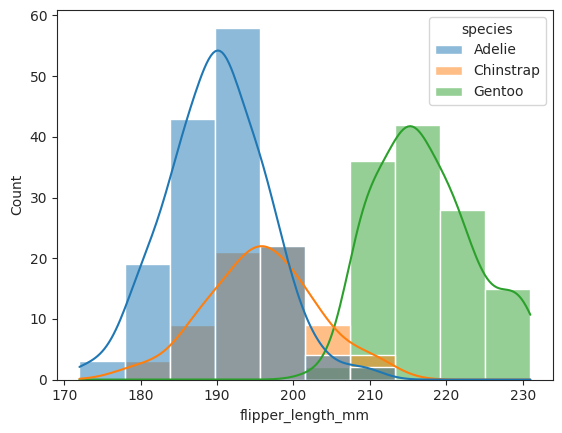
sns.histplot(data=penguins, x="flipper_length_mm", hue='species', kde=True)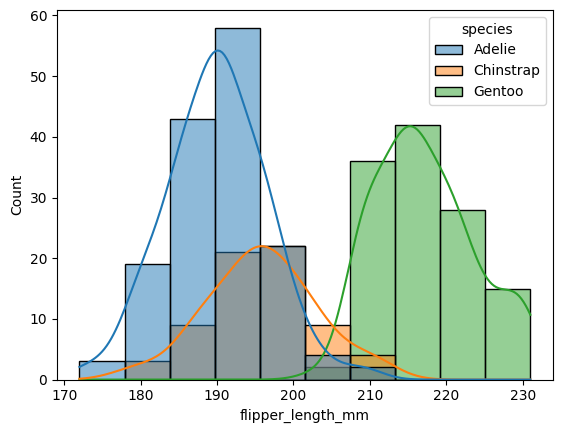
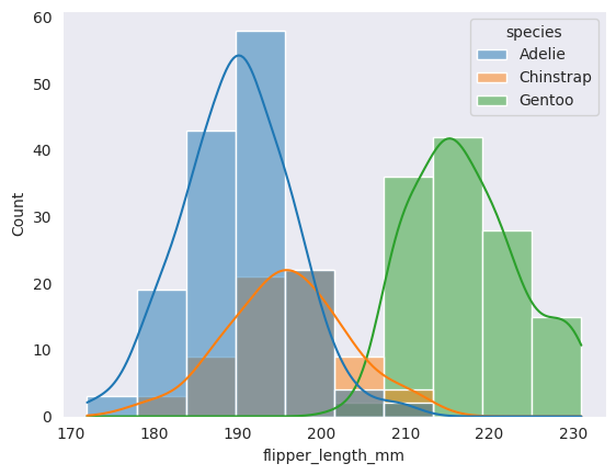
set_style)set_stypeを用いることでテーマを変更することができます。プリセットは5つ
darkgridwhitegriddarkwhiteticksimport seaborn as sns
sns.set_style("darkgrid")
penguins = sns.load_dataset("penguins")
sns.histplot(data=penguins, x="flipper_length_mm", hue='species', kde=True)
darkgrid

whitegrid

dark
white

ticks
set_theme)set_themeを使うとスタイルとパレット、フォントなどを変更することができます。オプションが豊富なので、詳しくは公式ページを参考にしてください。
styleは、上で説明したスタイルを、paletteは、deep, muted, pastel, bright, dark, colorblindが設定できます。
import seaborn as sns

sns.set_theme(style="whitegrid", palette="pastel")
penguins = sns.load_dataset("penguins")
sns.histplot(data=penguins, x="flipper_length_mm", hue='species', kde=True)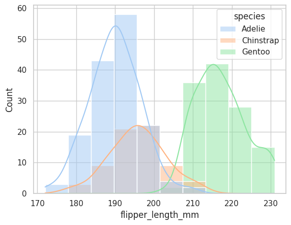
set_title)グラフにタイトルをつける場合は、set_titleを使うことでタイトルをつけることができます。
import seaborn as sns
import pandas as pd
import numpy as np
import matplotlib.pyplot as plt

sns.set_theme(style="darkgrid", palette="dark")

x = np.random.randint(0, 100, 300)
y = x + np.random.normal(0, 10, 300)
df = pd.DataFrame({'x': x, 'y': y})
g = sns.lineplot(x='x', y='y', data=df)
g.set_title("random graph")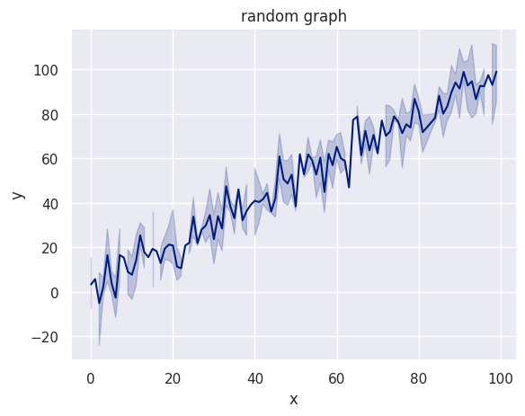
legend=Falseを指定することで凡例を削除できます。
import seaborn as sns
import matplotlib.pyplot as plt
import pandas as pd
import numpy as np

x = np.arange(0, 100)
x = np.concatenate([x,x])
y = np.random.randint(0, 100, 200)
z = ['A' for _ in range(100)] + ['B' for _ in range(100)]
df = pd.DataFrame({'x': x, 'y': y, 'z' : z})
sns.lineplot(data=df, x='x', y='y', hue='z', legend=False)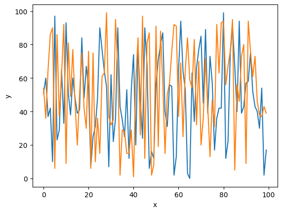
.で繋げて指示するseabornではパイプラインみたいな感じで、.で繋げることで指示を追加することができます。
例えば、上の「凡例を消す」の場合、以下のように記述することでも凡例を消すことができます。
sns.lineplot(data=df, x='x', y='y', hue='z').legend().remove()seaborn.objectを使ったグラフ作成Rのggplotっぽいインターフェースも実装されています。例えば、以下のようにすれば、折れ線に「点」を描画することもできます。
こちらの機能については別記事にまとめています

import seaborn.objects as so
import seaborn as sns
import matplotlib.pyplot as plt
import pandas as pd
import numpy as np

x = np.arange(0, 100)
x = np.concatenate([x,x])
y = np.random.randint(0, 100, 200)
z = ['A' for _ in range(100)] + ['B' for _ in range(100)]
df = pd.DataFrame({'x': x, 'y': y, 'z' : z})

so.Plot(data=df, x='x', y='y', color='z').add(so.Dots()).add(so.Lines())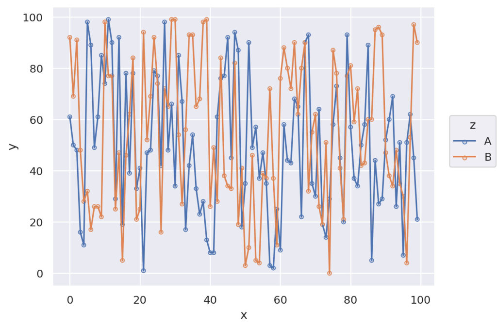
seabornはかなり多機能です。今回は自分が利用する部分について解説しました。
seabornの場合、あまり調整しなくてもそれなりに綺麗なグラフを描画できるのがメリットですが、細かなオプションを設定することでさらに好みのグラフに仕上げることも可能です。